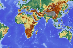
세계 지도

Walk into most any classroom, and you will see a large world map hanging somewhere on the wall. Teachers use maps for subjects like geography and social studies.
In the United States and other countries, schoolchildren have long learned from one kind of world map. It is called the Mercator projection.
This version of map is more than 400 years old. Gerardus Mercator, a European mapmaker, designed it for the purpose of helping sailors and ships on the high seas.
Today, the Mercator projection is the map of choice for modern-day direction-finding services like Apple Maps and Google Maps. It is also the map of choice in school classrooms and textbooks.
But map experts and other people say the Mercator projection should not be used in schools. They say it does not correctly show the sizes of countries and continents.
It is not an easy thing to show our three-dimensional planet in just two dimensions -- length and width. Gerardus Mercator’s 16th-century method made countries far from Earth’s equator appear larger than they are. Countries close to the equator appear small in comparison.
On Mercator maps, for example, Africa appears smaller than North America. In reality, the African continent is larger than all of North America. Mercator maps also make Greenland appear bigger than China. In fact, China is about four times larger than Greenland.
Now, school officials in the U.S. state of Massachusetts are replacing the Mercator map with one that presents a different view of the world.
Boston Public Schools is America’s oldest public school system. It is also the first-known American school system to use the Gall-Peters projection world map.
German historian Arno Peters worked on the projection in the 1970s. James Gall of Scotland first developed it in the middle 1800s.
Peters’ aim was to fix Mercator’s problems with sizes. He believed that map showed what critics called a “Eurocentric” world view.
Officials announced the change last month. Soon, Peters world maps will hang in classrooms across the city.
The change from Mercator to Peters is part of the school system’s efforts to “decolonize the curriculum,” said Colin Rose, an official with Boston Public Schools. He recently spoke with The Guardian newspaper.
Hayden Frederick-Clarke is also with Boston Public Schools. He told National Public Radio that 86 percent of the school system’s students are individuals of color. Maps such as the Mercator, he said, “generally classify the places that they’re from as small and insignificant."
“It only seems right that we would present them with an accurate view of themselves,” he told NPR.
Ward Kaiser is a writer, publisher and an expert on maps. In 1983, his publishing business produced the first English-language Peters maps in North America.
Kaiser supports Boston Public Schools' decision to move beyond the Mercator projection.
“I think on the whole it is a great decision, a right decision, because it helps enlarge the understanding of those students.”
Seeing a Peters map for the first time can be a strange experience. Land masses may look stretched compared to how they look on the Mercator and some other world maps.
Kaiser says he expects Boston students to be surprised when they have their first look at a Peters map.
“I hope that they will have an “aha!” moment. My experience is that in any school where this new map, the Peters map is being used, that does happen."
Every map has its purpose. At first, the main purpose of Gerardus Mercator’s map was to help sailors get across the open seas without getting lost. It was not supposed to be an educational tool, Kaiser says.
“When the (Mercator) map is used for other purposes than navigating, such as on classroom walls as a representation of the real world, that’s like using a telephone to brush your teeth. It’s the wrong use of the map.”
He adds that the aim of the Peters projection was to “show all countries, all regions, all continents, at their actual size.”
"...And people from Nigeria, or Thailand, or Venezuela, can gain a sense of their own value in the world, their place. They are not shrunk down. They are not marginalized. They are treated with respect in that sense.”
The Mercator and Peters projections are just two of many kinds of world maps that may hang in school classrooms. Many public schools in China, for example, use a map that shows East Asia near the center.
Kaiser said it is human nature to view one’s own place near the center of the world. Mercator himself put Germany -- his adopted homeland -- near the middle of his map.
“We all tend, no matter who we are, to see ourselves at the center of the world," he said. "Of course, not all maps do it so obviously.”
Maps are powerful tools, Kaiser says. And the map from which a student learns about the world can make a big difference in their understanding of -- and feelings toward -- others.
“The world is not their oyster. The world belongs to everybody. And if we treat people with respect and understanding, we may even get a better set of relationships in the world.”

